

Juiceting
Juiceting
Juiceting is an upcoming juice brand focused on promoting wellbeing and a healthy lifestyle and it is part of a new collaboration between nutritionists from the UK and an investor from Hong Kong. Superimpose was appointed as the branding designer and architect and took part as a shareholder to support the healthy initiative.
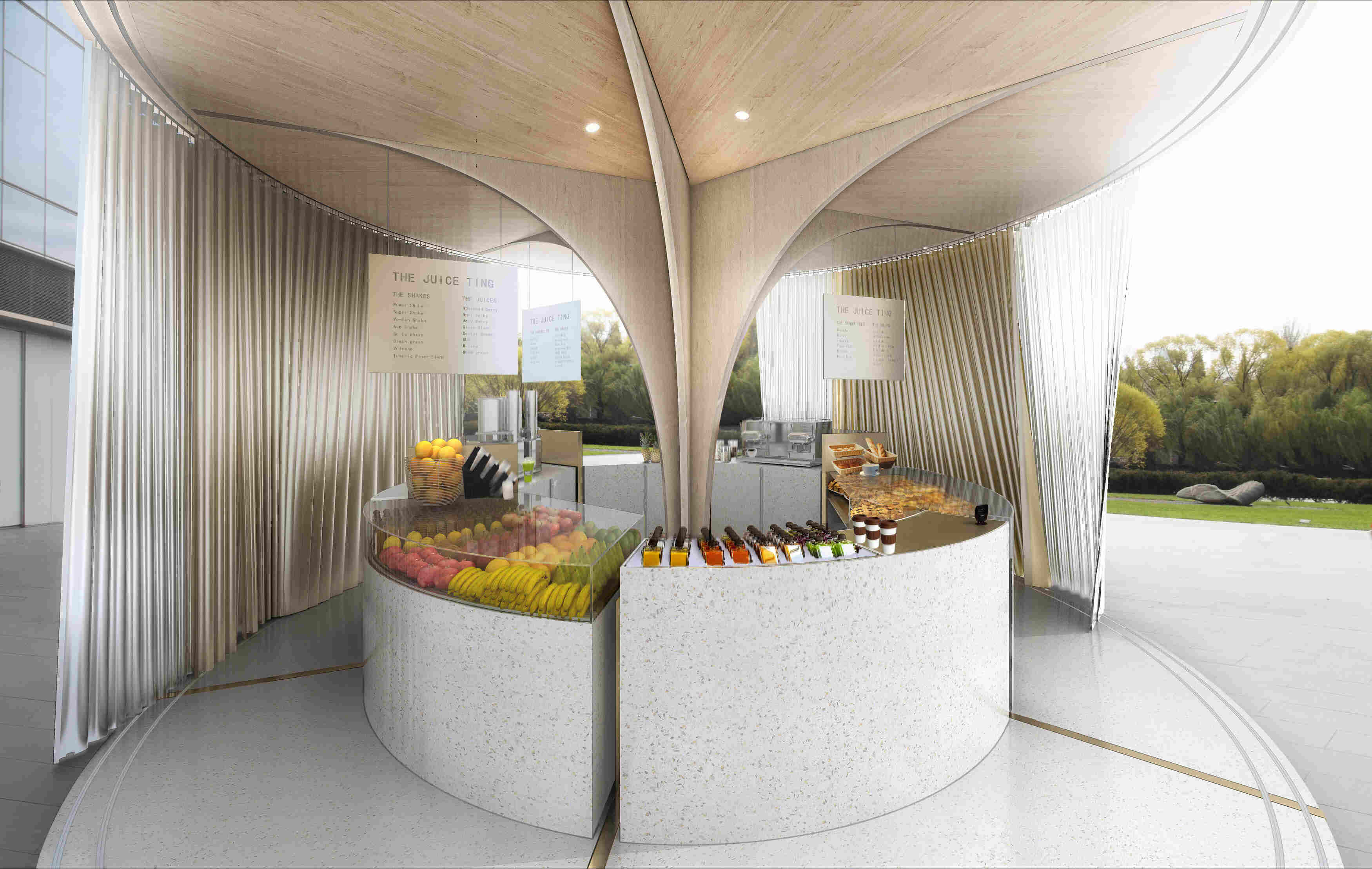
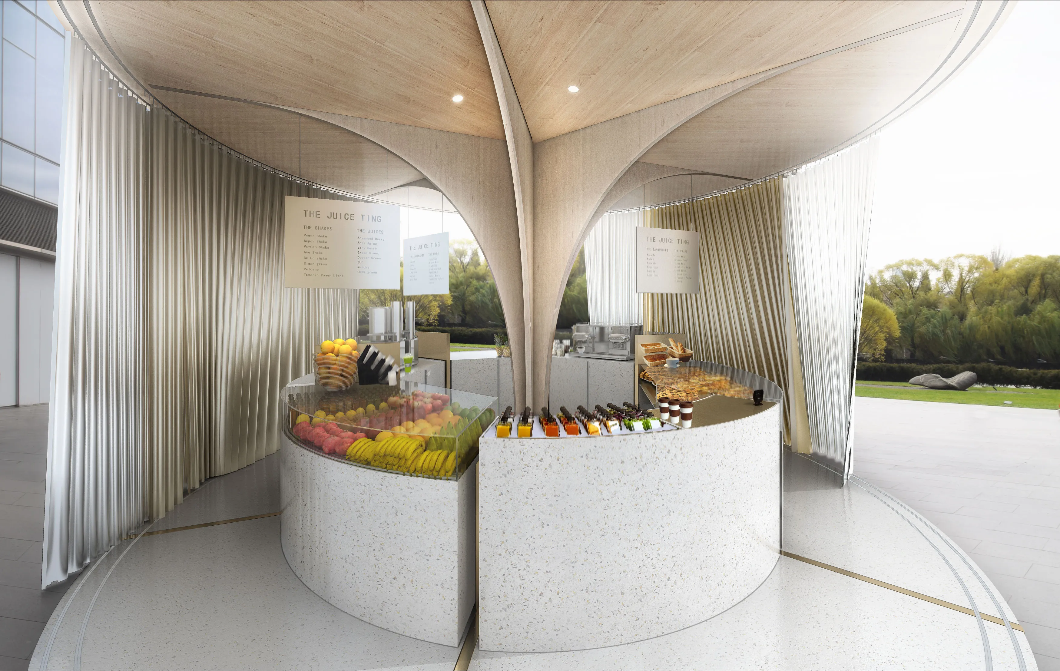
The second part of the brand name is ‘ting’ (亭), which means something similar to a ‘hub that gathers people’. It is an important and frequently used character, which in a way is a specific reflection of Chinese community culture. The branding design by Superimpose recognizes the value of the Chinese character for ‘ting’ and combines it with the English word Juice. Together ‘Juiceting’ underpins a clear customer, community and health oriented identity. The branding design is simple yet distinctive and includes logo design, bottle design, and house-style design.

01/25
Juiceting
Juiceting is an upcoming juice brand focused on promoting wellbeing and a healthy lifestyle and it is part of a new collaboration between nutritionists from the UK and an investor from Hong Kong. Superimpose was appointed as the branding designer and architect and took part as a shareholder to support the healthy initiative.
The second part of the brand name is ‘ting’ (亭), which means something similar to a ‘hub that gathers people’. It is an important and frequently used character, which in a way is a specific reflection of Chinese community culture. The branding design by Superimpose recognizes the value of the Chinese character for ‘ting’ and combines it with the English word Juice. Together ‘Juiceting’ underpins a clear customer, community and health oriented identity. The branding design is simple yet distinctive and includes logo design, bottle design, and house-style design.
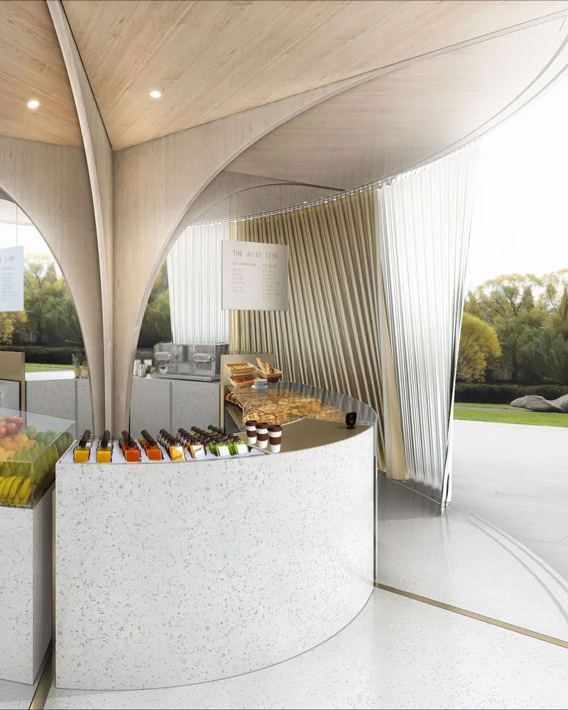
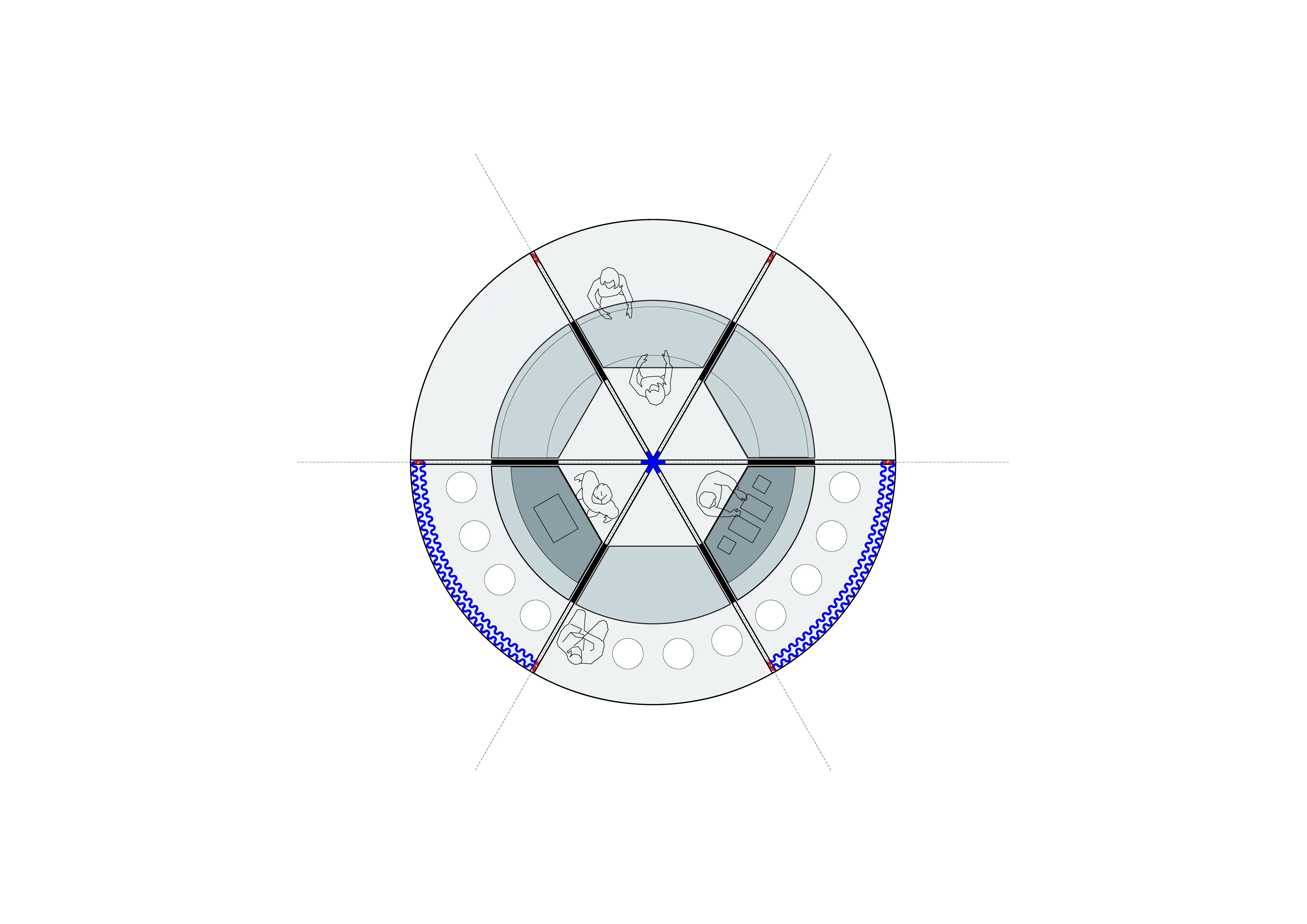
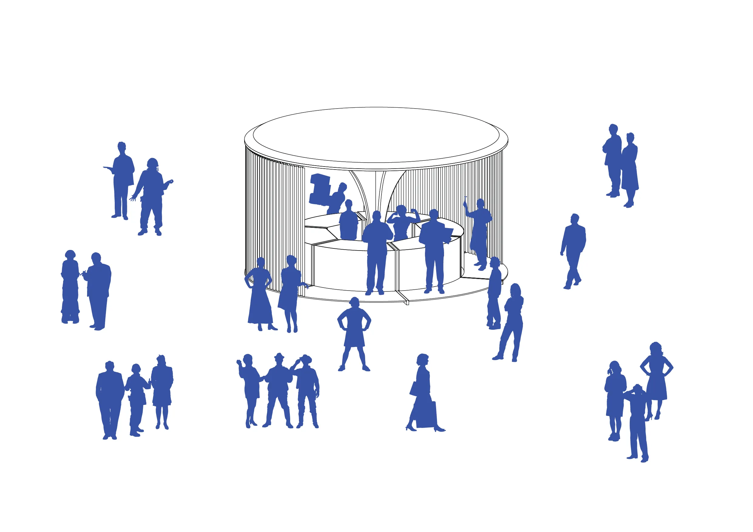
The architecture of the physical shop displays the concept of a ‘ting’. The circular open CLT-wooden structure invites customers from all sides to enter through a layer of mesh wire curtains. The products clearly displayed in the circular bar. The open structure is promoting interaction with the well-trained and friendly juice makers. Prototypes for physical Juiceting shops will be built in high-end retail developments in China.